NATURE RASA
Savour the Essense of Mother Nature's Love
Nature Rasa, a heartwarming mother-daughter culinary venture, was born during lockdowns, driven by the longing for the loving presence of parents, grandparents, and elders who prepared delectable meals, including nostalgic Indian pickles. Rejecting commercial options with artificial additives, Disha Verma and her mother embarked on a transformative journey to craft extraordinary pickles infused with a mother's touch and evoking fond childhood memories with a holistic approach of sustainable practices. Nature Rasa's premium selection offers the comforting taste of home, the care of a mother's kitchen, and the cherished essence of family love—a flavorful connection to the heart of a home filled with warmth and nostalgia- through their pickles, chutneys & jams.
-Brand Identity
-Illustrations
-Packaging design
-Social media design
-Creative direction
Domain:
Taste
Scope
Overview
The goal of creating a visual identity was to infuse the vibrance of Indian spices into every design element, capturing the heart-warming essence of a nature, through a harmonious blend of contemporary elegance.
Our communication approach centers on invoking nostalgic memories of home-cooked meals, where a mother's love and care resonate with every jar of our handcrafted pickles. By tapping into the emotional ties associated with homemade delicacies, we seek to create an authentic and relatable brand persona that embodies the essence of family traditions, comfort, and well-being.
We tried to seek inspiration from mindful eating, which is not just about the act of consumption but a celebration of cultural heritage and the precious moments shared around the dining table. By highlighting the connection between Indian pickles and the joys of savoring flavors mindfully, we encourage our audience to be fully present and appreciative of the culinary journey.

The Logo
The Logomark artfully encapsulates the essence of nature’s elements, gracefully swirling into a bowl, symbolizing the very best of nature brought to their customers. Characterized by its fluid and curved forms, the elements symbolise a sense of harmony and togetherness.


Secondary Logo

Logo Badge

Logo Submark
Warm and authentic, the brand's communication is inviting and evokes a feeling of togetherness, celebrating the cultural heritage and the cherished moments shared with loved ones. It conveys a sense of mindfulness, encouraging the audience to savor each bite and appreciate the flavors with a genuine and appreciative attitude.
The legible and clean letterforms of chosen typeface adds to the authenticity and genuineness of the brand. Whereas the display font used for the logotype reflects the brand’s warm persona.
Brand Tone &
Visual Language
TYPOGRAPHY / COLORS


Supporting Colours
Packaging Design
On the similar lines, a simple, direct, and highly legible packaging design was created for Nature Rasa's pickles, chutney, and jams. Embracing a vibrant and diverse color palette, the design draws inspiration from the rich and flavorful range of Nature Rasa's offerings, creating a captivating spectrum that reflects the essence of each product.


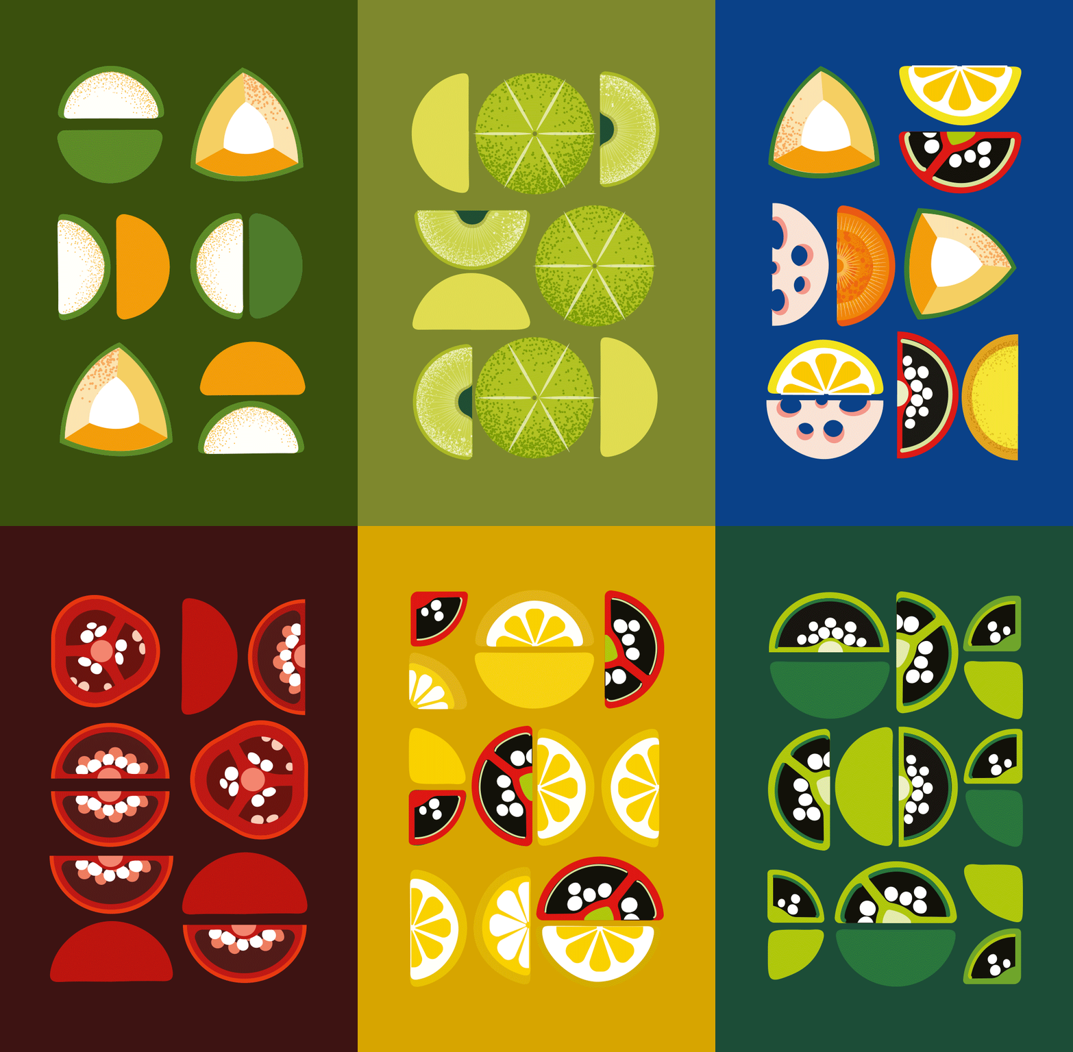
Illustration Style
Vegetable cutting styles impact taste, texture, and cooking time. The contemporary style highlights the beauty of fruits and vegetables with geometric forms, complementing the colors of Indian spices.


Social Media Marketing
The brand voice was further expanded through custom Instagram templates. Bright, eye-catchy colours with friendly and engaging tone in the form of quizzes, fun facts, recipes and more.


"My customers are loving the packaging designs of jars and my sales have naturally gone up!"
- Founder, Nature Rasa