
LA FUNKY MEXICANA
Be the Youest You
A year ago, Fernanda Alvarez, the visionary founder of La Funky Mexicana, a new funky fashion brand based in Mexico, approached us to create their distinctive visual identity. True to its name, the brand aims to infuse a playful and lively collection that celebrates the vibrant colors, patterns, and cultural influences of Mexico while incorporating contemporary and eclectic styles. As a brand championed by powerful women, it exudes a spirit of fearlessness and confidence, leaving a lasting impact on all it touches. From funky jewellery and pet accessories to bag straps and apparels, the brand's vibrant designs serve as a symbol of joy, authenticity, and inclusivity. Together, the creative journey unfolds, empowering individuals to embrace their true selves and radiate their inner light to the world, as a collaborative effort curates an eclectic range that reflects the essence of La Funky Mexicana.
Scope:
Logo design
Packaging design
Visual Identity
Marketing Collaterals
Domain:
Style
A Funky Affair
The approach to creating an identity was to depict the brand with a dynamic and vibrant personality that reflects its funky and eclectic essence. Celebrate the rich colors, patterns, and cultural influences of Mexico while blending them with contemporary and playful elements. The design strategy revolves around creating a sense of excitement and uniqueness, capturing the brand's spirit of fearlessness and empowerment.


The Logo
The logo draws inspiration from the founder's vibrant personality, reflecting the essence of La Funky Mexicana - a brand that embraces life and celebrates every moment with an adventurous spirit. It exudes a sense of energy, love, and excitement, capturing the essence of those who have an 'eye' for living life to the fullest.
Logo Variations
Logo mark
The color palette selected is edgy and vibrant, skillfully complementing the brand's pastels. As the products themselves are already bursting with colors, our decision was to strike a perfect balance, allowing them to truly stand out and pop with even more vibrancy.
Two different fonts were chosen for display typefaces to add depth and visual interest to the brand's overall look and feel. It creates a cohesive yet visually engaging experience for the audience, capturing their attention and conveying the brand's essence with a unique blend of creativity and contemporary flair.
Brand Tone & Visual Language
COLOURS/ TYPOGRAPHY/ VISUAL ELEMENTS

Supporting colours


The patterns and motifs draw inspiration from Mexico's rich cultural heritage, known for its lively and celebratory nature. The influence of Latin festivals, gatherings, and enjoyment is beautifully reflected through the intricate paper cut work of 'Papel picado,' a traditional Mexican folk art. This art form adds a sense of festivity and artistic flair to the brand's visual identity.
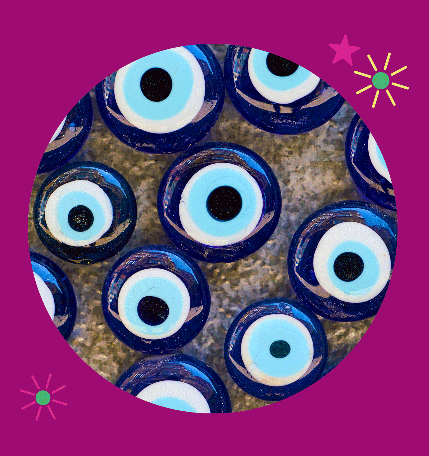
Additionally, the design is also influenced by Mexico's deep-rooted spirituality, incorporating symbols such as the third eye and Sacred Heart. These elements convey a sense of mystique and connection to the spiritual realm, adding depth and meaning to the brand's overall design language.
Print Collaterals
La Funky Mexicana began with funky jewelry and expanded to include packaging collaterals such as swinging tags and bag labels. Later, printed catalogs were introduced to showcase the brand's diverse offerings and more.


Sacred heart
Eye for Hope
Togetherness
Zestful


"This is simply awesome! Exactlly what I wanted my brand to look like. Mucho love!"